Yanko Design - Latest Posts |  |
| Posted: 10 Mar 2009 06:13 AM PDT I don't mean take a knife and cut it into eight parts but instead follow the design that our friend Charlie has in mind for us. He has devised the Dynamically Augmenting Wheel System or simply DAWS. His aim was to design a wheel system that would allow a car to shift its center of gravity without loosing its traction footprint. DAWS is kind of inspired by a motorcycle wheel. Lemme explain, a motorcycle wheel allows you to shift or roll your body into a turn giving the bike improved maneuverability and is accomplished by having rounded wheels. This also implies that a bike wheel has a "decreased footprint size when compared to a car wheel and sacrifices traction hurting acceleration, braking and turning speed." DAWS essentially features eight segments that are guided on a liner bearing at the hub the wheel can shift the entire vehicle without decreasing footprint size. The motion is kinda similar to our foot movement than a conventional wheel. Do check out the animation version here, its right at the bottom of the page. Designer: Charles Pyott
|
| Posted: 10 Mar 2009 04:05 AM PDT It's a total hash of digital and analog ideologies and still looks uber-cool! I guess this is what an iPhone-esque phone would have looked like in the 80's. Calling itself the Touch Screen Rotary, this phone is a Retro Blast but with modern functionality. Needless to say, touch controls on the rotary are there and so is a backlit screen. If you plan on calling me on this phone I will know it's you thanks to the incoming caller ID. For the externals the designer proposes a highly polished ABS lined with a frosted polycarbonate base that glows each time a call comes in. VOIP or landline, the phone swings both ways! Designer: Mark Miller
|
| I’d Hook My Bike Up to Nothing Minus Posted: 10 Mar 2009 01:58 AM PDT Nothing less, that is, than “P+!” It’s the P+ bike system. Created by Young-Min Kim, Hyeon-Jeong Woo & Kyung-Goo Lee to promote healthy bike use in areas that don’t normally tend to bike users (especially in the way of bike protectors, information kiosks, and rest seats!) Spring is here, time to bike! P+ bike system for safe keeping! There are three kinds of P+ objects: the rack, the signpost, and the bench. As you can see, the signpost is unique in its hight in this project, sitting slightly above the height of a mountain-bike, for easy viewing by bikers. These signposts hold important information about the area and the line of racks and benches. The benches and the racks are basically the same animal. The same shape allows for people to sit in a variety of ways, with or without the bike chained up at the same time. What I’d like to see added would be some LightLane lights, self-cleaning racks incase of exploding locks, and a way to hook up my Jet-Bike. Don’t miss a single bike-related design on Yanko. Designers: Young-Min Kim, Hyeon-Jeong Woo & Kyung-Goo Lee
|
| Flashlight Fit For Home Improvement Posted: 10 Mar 2009 12:33 AM PDT You have reached the top-notch of society and are you still going to hang on to those tools from yesteryear? Noooo…you need to move on mister, break away from the shackles of that old rusty torch that needs to be smacked on its head till the tiny bulb splutters into life. Get something flashy as this Railroad Flashlight that boasts of specs that would make Tim Allen proud of you! Flashy here is a nice colorful torch that features a rubber-coated body, making it shockproof. Need both the hands to do the job plus the light; no probs it's got a flexi handle that allows you to place it on the ground at a convenient angle. Need to hang the bloke…go ahead and do that as well! Even the reflector assembly can be rotated at any angle to focus the beam bang on target. The translucent plastic glows on the periphery of the reflector and doubles up as an added safety feature. This portable light uses DC power as a source. See the light? I told you it's a bright IDEA! Designer: IDEA
|
| Paper Clip with Several More Spins in It Posted: 10 Mar 2009 12:01 AM PDT What! Everyone knows there’s only a couple turns in a paper clip. And that paper clips are not fun. No fun with paper clips allowed! What Art Lebedev Studio has done is totally add metal to this legendary invention, curve it up a bit more than usual, and slap an excellent name on it. “Super Paper Clip!” it was named, later changed to the more Russian “Skrepkus.” More paper can fit in there! And more loops means more fun. More fun in paper clips. That’s what I like to hear. But really, honestly, what I’m sure every loyal Yanko reader is thinking is : “where’s the heart?” Check out the original sketches. Designer: Art. Lebedev Studio
|
| Are You Cuckoo for Nooka Fluff? Posted: 09 Mar 2009 04:25 PM PDT What we have here is a cute little watch. It is flexible rubber, digital, and is basically an arm-cuckoo clock. Kind of like a Rodger Rabbit sort of thing. More fantastic work from the folks at Nooka, right? Actually, not affiliated. Inspired by! Hannes Grebin submitted this to us (and half a dozen other design blogs) and I’m sure it’s about to blow up! Rightfully so? *Blow up on the internets, I mean. I’m sure it works just fine. Have no fear! lol. Grebin has this to say about his watch:
I know some of you folks are down on the “slap on an Apple symbol and call it good” train of thought, so what do you think of this? Appropriate? Necessary? P.S. the watch! Would you wear it? It sort of walks the line between young adult and fashion-sensitive-hipster / scenester. Let Grebin know who should wear it here, or visit his site http://grebin.de/ and give him a call. Designer: Hannes Grebin
|
| Your Computer Looks Like Rocks Posted: 09 Mar 2009 10:08 AM PDT Modular computing isn’t anything new. Designers have been toying with the idea for years but the Stream concept is unique in packaging the whole experience in a form more conducive to zen relaxation. Made of up modules (natch!), the Stream concept consists of Experience, Core, Component, Display, Charging Cradle, and Charging Base systems. You can arrange the modules any way you want as long as they’re on the main Charging base - much more beautiful to look at than even the most beautiful Macs Cupertino can pump out. It’s quite the complex system so lets break down what each one does. The Experience modules are your software and connectivity modules. For example each “river stone” represents media, documents, games, and external connectivity like VOIP. The Core module is the guy that makes sure every thing is communicating and working together. The Component modules are akin to hardware you’d find inside standard computer, i.e. processors, ram, graphics. The Display module is self explanatory. It uses a new UI called Locus (location based interface) which basically means (correct me if I’m wrong Barton) the display knows what you’re doing and how you’re using it so the UI adapts to better suite it. Charging Cradle keeps the Display module(s) juiced. Charging Base keeps everything else juice via wireless charging - advance form of induction perhaps. Lets make up a scenario to better illustrate the idea. Say I go to the store and am only looking for basic email, web, game, and mobile phone capabilities. I pick up the required pieces which are the Core and Charging modules, then accessorize with all the commentary pieces. A rock for each component of a normal computer and a rock for each feature I want the computer to possess. I take it all home and artfully arrange everything so it looks good on a desk I no doubt purchased to accent my new rock garden. I later decide I need a more powerful computer for gameplay so it’s back to the store, only this time I don’t have to chuck the whole thing - all I need to do is replace the CPU and GPU rocks with more powerful ones. I grab my VOIP rock and my MP3 player rock (for the road trip) and my display since it too can act as an independent system - in this case perhaps a GPS system to find the fastest route back to the store. The story can go on and on but I’m sure you get the gist. There’s a slight disconnect tho because in time your desk could be overflowing with rocks. However it’s the idea of purely envisioning our future computerlative systems as extensions of our homes, personalities, and needs. It doesn’t necessarily have to be a river rock metaphor. This analogy could exist in almost any form - legos, cubes, stuffed animals and that excites me. Cloud computing be dammed! Designer: Barton Smith
|
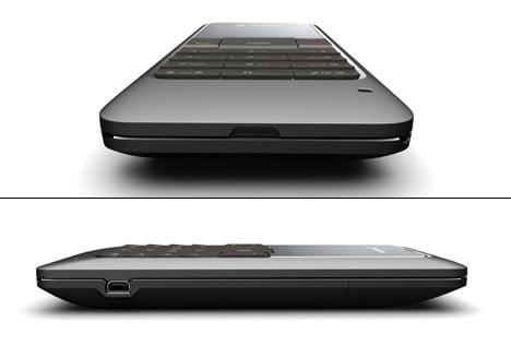
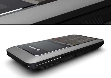
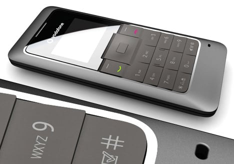
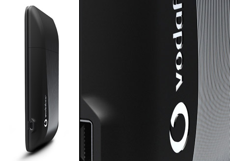
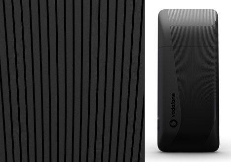
| Posted: 09 Mar 2009 09:22 AM PDT nr21 DESIGN introduces one of its latest designs, the Vodafone 135. This will be one of the most affordable mobiles on the market. The Vodafone 135 is a classic candy bar phone, designed to make mobile communications affordable in developing markets, thanks to a short two line black and white display suitable for calls and texts. It will be available this summer on prepay tariffs. The pure and slim shaped VF 135 shows a high level of precision and detail compared to other entry devices, due to the clear geometry and an interplay between matte and glossy areas. All keys are integrated in one rubber matte with a prominent relief for improved haptic feeling. The matte rubber material shows a clear contrast to the high-gloss display lens. A molded pattern on the backside gives the handset a modern and appealing look. Designer: Nr21 Design
|


| You are subscribed to email updates from Yanko Design To stop receiving these emails, you may unsubscribe now. | Email delivery powered by Google |
Inbox too full?  Subscribe to the feed version of Yanko Design in a feed reader. Subscribe to the feed version of Yanko Design in a feed reader. | |
| If you prefer to unsubscribe via postal mail, write to: Yanko Design, c/o Google, 20 W Kinzie, Chicago IL USA 60610 | |
1 comment:
Thanks for sharing the design.
bike games,
Post a Comment