Yanko Design - Latest Posts |  |
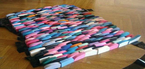
| Posted: 06 Apr 2009 04:30 AM PDT I am totally floored by Ilya Fridman's design for a Dog Hammock. First of all as a dog-lover, I simply adore the idea of getting a pet pooch his own hammock, and to top it off the dog-bed helps in subtly collecting stray dog fur by harnessing the attraction power of static electricity. What a blessing! Ilya also win's my vote for using recycled materials in the construction of Jamboree. For the hammock, he has used rubber as a raw material, collected from old flips/flops (or thongs) to create interwoven brickwork bed. The rubber creates a static charge whilst the dog is lying on it and attracts all the stray fur onto it. The frame is designed to be laser-cut and folded out of various materials including steel, aluminum, acrylic or paper and can be fashioned in varying sizes according to the size of the dog. The connecting cable used in this prototype is one from an old clothes line, which is a steel cable with a plastic outer coating. We all know that cleaning the fur shed by pets is such a chore; full marks for your thought process Ilya! Designer: Ilya Fridman
|
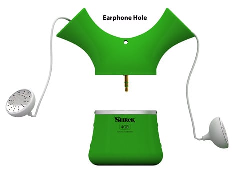
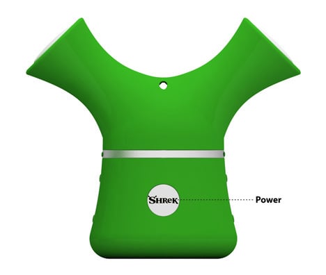
| Posted: 06 Apr 2009 03:14 AM PDT Will you think less of me if I confess that even at my age I find cartoons and children's programs adorable? I mean, why is that grownups have to be judgmental and scorn Mr. Bean or scoff at Tom & Jerry? Why can't we be as easygoing as innocent children? For example I can literally visualize many of you going "Tch Tch, why is this Shrek MP3 player here? This ain't a toy store!" FYI, it's here coz many well known MP3 manufacturers ignore something as vital as earphone management while designing their players. The childish (yet cute!) player puts retractable earphones in the ogre's ears. Here is a prime example of how a one can twist the odd shape of Disney's bane into something constructive. Designer: Sang-hoon Lee
|
| Posted: 06 Apr 2009 01:09 AM PDT I'm done with the Tupperware era where every party and host-gift excited me no end. I've come to the point where I think I own almost everything in the catalog. The only way I think the company can infuse a breath of fresh air (pun totally intended!) into their lineup is, if they consider this Compost Concept. Quite contrary to the food-storage options that company is so famous for, the collection pail and outdoor compost bin offers an easy option for those who believe in recycling garbage. The main compost unit is designed with an outer roto-molded shell that is used to keep the decomposing pile insulated and shielded from the elements and varying weather conditions. Besides the main unit there is a smaller pail that you keep indoors to collect all the waste and deposit it to the main bin at convenience. To make sure you get the procedure coorect, Ken explains that you need to mix in greens : browns in the ratio 1:5 to get the right levels of nitrogen and acids. Water the pile until its gets moist enough and occasionally mix it to speed the process of decomposition. Educative as this sounds, I wonder how many of us actually consider recycling our kitchen waste and how many of us will get motivated to do so, if Tupperware approves of this concept? Designer: Ken Jasinski
|
| Beauty is Minimal, OneLessDesk Review Posted: 06 Apr 2009 12:39 AM PDT A long while back we were enamored with a seemingly simple bi-level desk from a company called Heckler Design. After a couple emails and a lot of patience (thank you Dean), we finally have our review of the OneLessDesk. At first glance, you’d be hard pressed to understand why something this simple could command a $649 price tag. But as with most minimalist designs, it takes some creative engineering and expensive manufacturing to pull out the perfect balance between aesthetic/function. Hit the jump for my review. When it finally arrived at my door, I found a huge box strapped with metal bands protecting an already pre-assembled desk wrapped in plastic. That took half the frustration out because I HATE assembling furniture. I couldn’t wait to free it from its thickly padded cage and when the final sheets of plastic came off, I stood in amazement. Let me say this now. THE PICTURES DO NOT DO IT JUSTICE! It’s ABSOLUTELY GORGEOUS. This is laser cut metal at its finest. Only a few millimeters thick but there’s no give, bend or flex. It’s completely solid and if the rigidness doesn’t convince you, life it up, it’s HEAVY. At every curve and corner, the edges are softly beveled so there are no sharp edges. The texture is smooth but slightly tactile. I received the black version which looks like powdered steel. Again, absolutely stunning. As I said before simplicity masks how utilitarian the OneLessDesk is. The bi-level design works multiple ways. If you have a desktop, place it on the top level with keyboard and mouse on the lower one. If you have a laptop, place it on the lower level and invest in a beautiful large widescreen display for the top one. The lower level also slides right underneath the top one bringing the total depth to a narrow 14 inches which reminds me. The OneLessDesk is quite compact even tho it’s 30 inches tall and nearly 34 inches long. The whole thing stacks up neatly against a wall. Come around back and you’ll find a surgically laser cut shelf with precisely machined cable guides to keep all those would be messy cords neat and tidy. The shelf is also perfect to hide external hard drives and power bricks keeping the best parts of the desk clean. After all, minimalist design demands surfaces. Is it worth $649? Yes and I’ll tell you why. I visited some of the best design stores in Los Angeles looking for similar desks. Shopped online for anything remotely close and you know what - nobody else is doing this at this price point. The few that I came across were reproductions that earned $2,000 price tags by virtue of nostalgia. The OneLessDesk comes in 4 colors (5 including the special edition) and ships almost anywhere internationally. Try getting any of those furniture stores to ship you anything for under $100 bucks. What we loved:
What could be improved:
Designer: Heckler Design
|
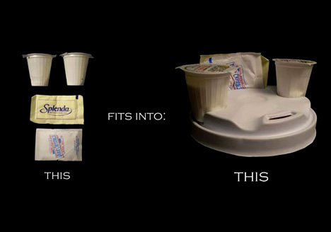
| You Been Dunkin’ Long? Nice Cap. Posted: 06 Apr 2009 12:01 AM PDT So you’ve got a mess of a tray there, coffee commuter. You look like you’re in the mood for a better top. Small innovations for a gigantic industry. Hot coffee’s new top is the “Coffee Top Caddie;” what basically amounts to a new mold for the plastic top that fits on top of your coffee cup. With this innovation, you can fit everything you need for that trip from the counter to your table or the order window to your car. Do you have any idea how dangerous it is to drink coffee in your car? You must be nuts in the head. Check out this new top for you crazies. Put the creamers and the sugar packets right at the head of things. Designer: Josh Harris
|
| Posted: 06 Apr 2009 12:01 AM PDT Welcome to a proposed extension of the Stockholm Public Library. This project, called “The Book Hill” is one that makes use of what were thought to be limitations in the landscape to create a building that not only holds books, but acts as a landmark for the city. These limits include the Observatory Hill that sits next to the site; giant, beautiful, too steep to be useful, and the library in place; the Asplund library, with its three detached annexes that separate the library into four. The solution is a snake. A “continuous boulevard” from street level to Observatory Hill top. The most obvious perk of which is the glorious view of the city, not normally accessible without hovercraft or helicopter. Books? The fiction section will remain in the Asplund Library, while the sciences will run in one continuous “string of pearls” in order from bottom to top along the “Media Boulevard.”
All this intersected by The Short Cut. An axis which acts as an access, the main entrance which exits into the Observatory Hill. Designers: Jan Yoshiyuki Tanaka & Jakob Steen Christensen of JAJA Architects
|
| You are subscribed to email updates from Yanko Design To stop receiving these emails, you may unsubscribe now. | Email delivery powered by Google |
| Inbox too full? | |
| If you prefer to unsubscribe via postal mail, write to: Yanko Design, c/o Google, 20 W Kinzie, Chicago IL USA 60610 | |










No comments:
Post a Comment