Yanko Design - Latest Posts |  |
| When France Gives You Champagne, You Make… Posted: 17 Apr 2009 12:17 PM PDT Beauteous industrial designs. Below check out three top amalgamations of the eco-friendly totally-new Veuve Clicquot champagne box. Devour the color of this “Design Box,” first of all. Look at that yellow! Or is it gold? With red accents. Oh then also it’s made of paper. Paper only. Less than 5% coverage with inks, glues, and solvents. And no plastic film. And micro-grooving is used to reduce the amount of paper in the packaging. AND the paper is FSC approved. What’s that mean? FSC: “The paper used comes from forests under management of the FSC (Forest Stewardship Council), a non-profit organizationestablished to promote the responsible management of our forests.” Wowie. Now check out some of the projects inspired by the box, along with renderings of all three and in-progress pics of the couch and the cellar. 1) Couch by Front Design Boxes stacked and arranged to create an interesting albeit seemingly difficult to clean couch. That’s not to say it’s not splendidly-modern and probably truly comfortable for it’s squareness. Take a peek at the pic that shows one of the designer ladies from Front having a sit on a bit of it : doesn’t she look joyous? 2) Lamp by Tom Dixon: part of an edition of 500 lamps for the greater good of cut-up letters! Slicing graphic design projects up like this can go wrong, but sometimes can go terribly, terribly right. This sort of letters-to-chopped-pattern motif is a trend that’s not quite reached it’s peak yet. It’s still big in the designy-shops in my city of Minneapolis - here Dixon does it right. 3) Cellar by 5.5 Designers: a wall I wouldn’t mind testing out in my house. The repetition works, and so does the brickery motif. Super orangy. Notice how the design of the box becomes the pattern for the whole object. The cellar is built to house the champagne boxes in the same way store shelves are sized to fit them for distribution. Ideation abound! Fit to win. Designer: Veuve Clicquot featuring Front Design, Tom Dixon, 5.5 Designers
|
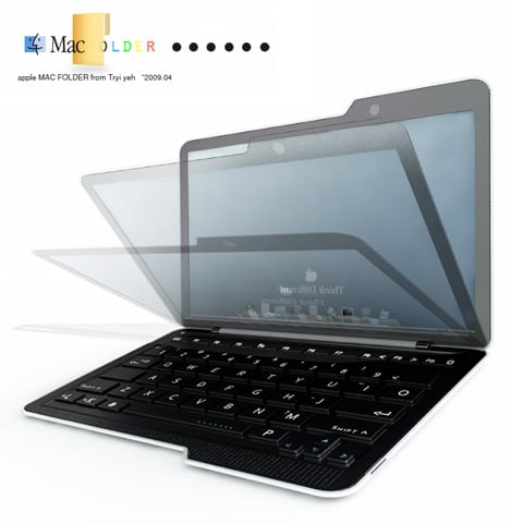
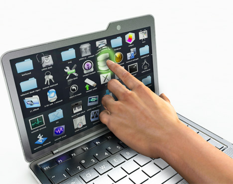
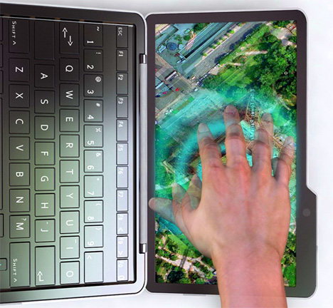
| Posted: 17 Apr 2009 12:15 PM PDT Is it next MacBook? no, but everyone likes to put their 2 cents in. It’s called the Mac Folder - not all that different from any other laptop but this could be the netbook everyone wants/expects Apple to make. The UI has been reworked to work more like the interfaces seen on the iPod Touch and iPhone and of course it has a multi-touch screen and OF COURSE it’s as thin as Kate Moss if not more. Want one? Designer: Tryi Yeh
|
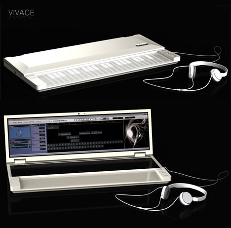
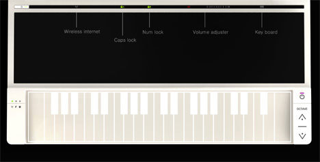
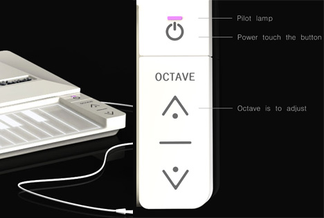
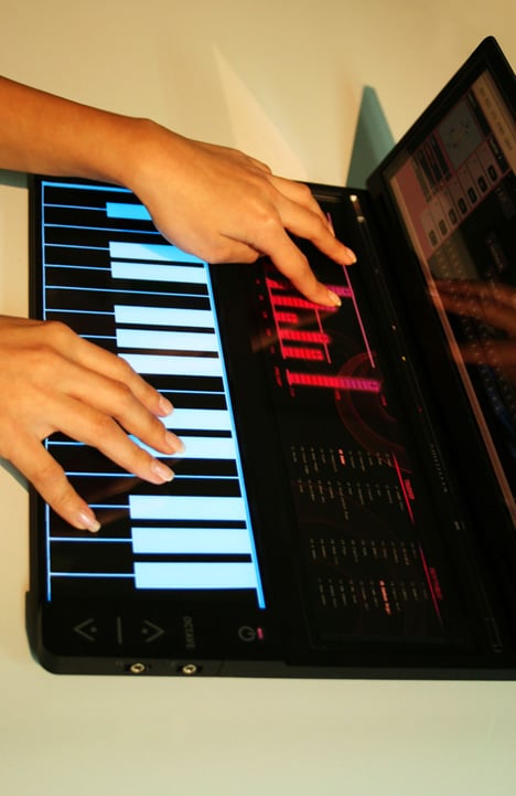
| Posted: 17 Apr 2009 12:05 PM PDT Music aficionados rejoice. The idea of having only 1 device that combines multiple instruments, track recording, equalizer, sound editing, internet connectivity, and a touchscreen interface all into one compact package is drool worthy. The Vivace makes it all possible. Information is scarce on how the interface works but I have no doubt up-and-coming artists like FrankMusik and Bjork could do a lot with such a device. Designers: Young-Shin Lee & Hae-Jin Jung
|
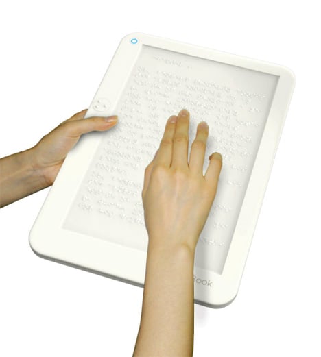
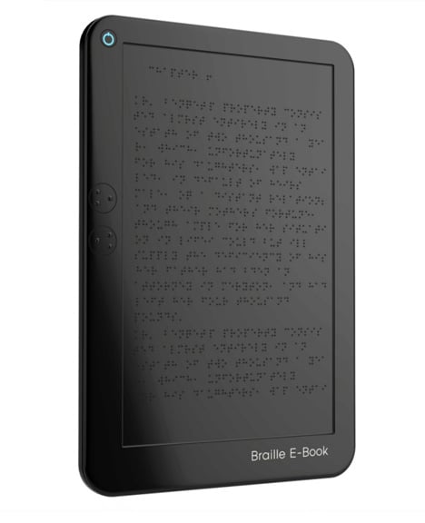
| Posted: 17 Apr 2009 11:58 AM PDT Visually challenged people require braille books in order to read. However, not many books are available in braille due to cost and inefficiency. Translating a 500 page book into braille nearly doubles the thickness. EAP is a technology that can dynamically change the surface pattern by way of an electromagnetic signal - simulating braille text. Not exactly a new idea but a nice executive nonetheless. Designers: Seon-Keun Park, Byung-Min Woo, Sun-Hye Woo & Jin-Sun Park
|
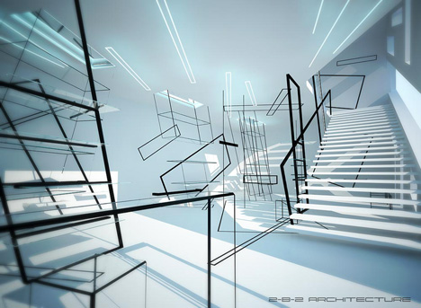
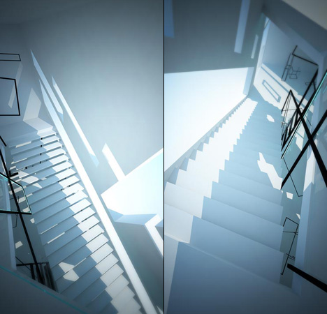
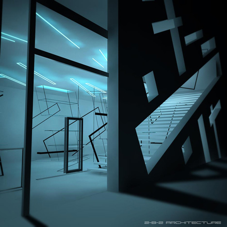
| Vertigo Inducing Kazimir Supermatic Posted: 17 Apr 2009 11:40 AM PDT This highly conceptual interior space with spatially graphic planes meeting into floors meeting into ceilings meeting into walls is not for the faint at mind. Kazimira Malevich’s supermatic compositions are prototypes, schemes on which the spectator can define his/her own spacial relationship within the room. Even the shadows cast by the lines create more geometric planes to confuse the visitor. You know how crazy colors and patterns can make you dizzy? Imagine how a monochromatic room would make you feel. Remember to take a dramamine before entering. Designer: 2-B-2 Architecture
|
| Sit Down With a Nice One-Cable Espresso Posted: 17 Apr 2009 08:44 AM PDT Returning hero Andrew Seunghyun Kim - whose been getting designs published with Yanko since 2007, presents this all-in-one screen. It’s the “Espresso” and it’s got one cable. It’s your TV, your multimedia collection, and your home internet display. Built-in DVD player, speakers, and wi-fi. Slots along the right side for plug-n-play add-ons. Available in 2 colors: single-shot or double-shot - for those of you who need that extra jolt. Then- touch screen remote- coffee cup touch charger for the remote. Touch everything. The remote is reel-similar to what the modern iPod screens look like, along with the fluid covers n’ stuff. The bottom or back-side of the remote has a ridge to resemble the bottom of a coffee cup, which, incidentally, makes it nice to handle. And the coffee cup you see below is the charger for the remote. Just place it on top! Induction! I encourage all Yanko users to comment on this project here, of course, then explore the rest of Andrew Seunghyun Kim’s designs here on Yanko : Search “Andrew Seunghyun Kim”, then read Kim’s message board post over at Core77 - kindly submitted to us by 울트라 쫄핑크 TaoNova. Thanks for all tips! Designer: Andrew Seunghyun Kim
|


| You are subscribed to email updates from Yanko Design To stop receiving these emails, you may unsubscribe now. | Email delivery powered by Google |
Inbox too full?  Subscribe to the feed version of Yanko Design in a feed reader. Subscribe to the feed version of Yanko Design in a feed reader. | |
| If you prefer to unsubscribe via postal mail, write to: Yanko Design, c/o Google, 20 W Kinzie, Chicago IL USA 60610 | |
No comments:
Post a Comment