Yanko Design - Latest Posts |  |
- Story Of The 90 Degree Charge
- My Happy Office Beer
- Do Not Shake Vase
- Audi Avatar Supercar
- When Colors Speak For Kids
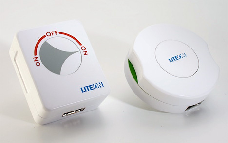
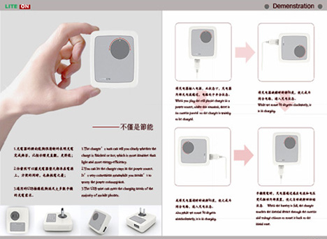
| Posted: 27 Oct 2009 03:48 AM PDT Plug on your gadget and hit the switch on…gadget recharges but you switch it off at your convenience; Waste of electricity. Let's change this scene a bit, plug into the 90 Degree Charger, and rotate the plug manually to complete the electric circuit, like you do with a timer. When the gadget gets tanked up, the plug-point rotates back to the normal position, breaking off the circuit, thus saving on electricity. All eco-freaks are Happy! And So am I! Designers :Jie Zhang & He-Peng Wei
|
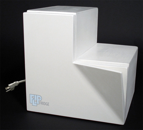
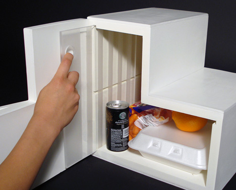
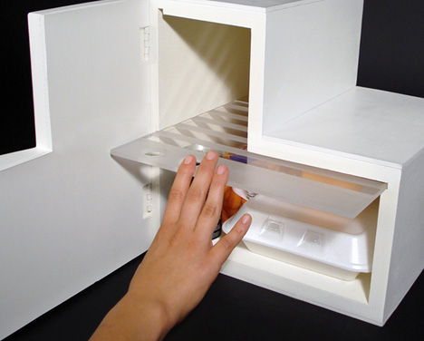
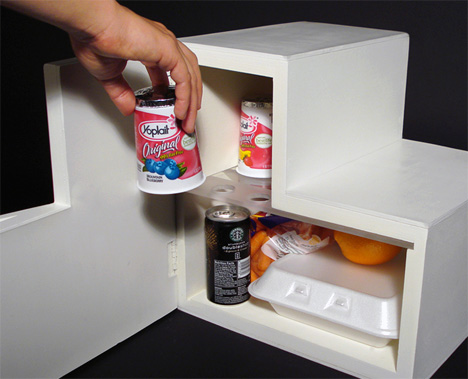
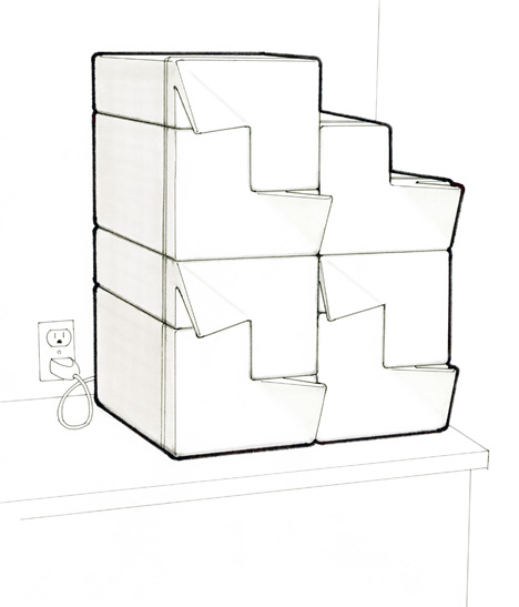
| Posted: 27 Oct 2009 03:02 AM PDT It doesn't hurt to fantasize about guzzling chilled beer while working in office, except most offices don't have refrigerators (or beer-guzzling policies), and even if they did, you couldn't trust anyone not downing your can! So how about this personalized locker-style Flip Stacking Personal Fridge for the Office? It's the sort of mini-fridge (for each employee) that you can stack a-top of each other. Its' unique L-Shape makes it easy to stack and it uses Thermoelectric technology allowing it to work in any orientation, even upside-down! On the whole its able to accommodate cans, bottle and items that are up to 10 inches wide, as well as 10 inches tall, but takes up 25% less room than a 10-inch cube! It includes a stow-away shelf, letting the user mod the interiors according to items to be placed. I really dig the door handle though! Designer: Spencer Schimel
|
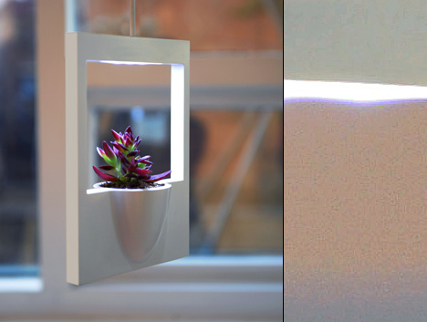
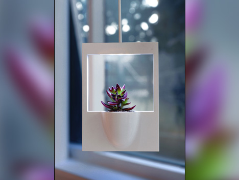
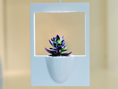
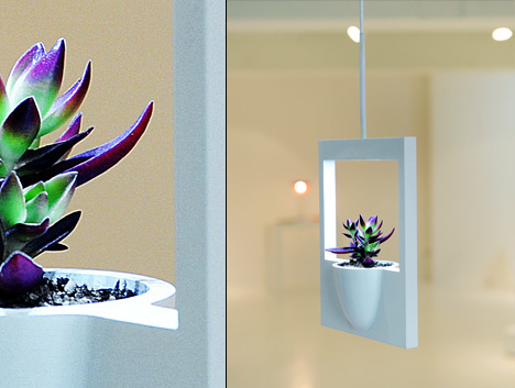
| Posted: 27 Oct 2009 12:01 AM PDT We’ve had our share of vase concepts here on Yanko Design, and this is definitely one of them. It’s strikingly similar to a previous “framed vase” design we published some months ago, but it’s unique in it’s shape and execution. The line holding the frame is a wire, the wire bone’s connected to the light bone, and the light shines on the plant. Super cute. The frame of course uses the famous Polaroid photo ratio to replicate the famous instant-photo look. If you look around the internet you’ll find this look replicated in quite a few places in website design, especially when people are displaying mass amounts of photos or image-links. This frame was made in light of the loveliness of containing a moment in just a moment, then displaying it simply from then forevermore. Fun, yes? Designer: Hwajin Jung
|
| Posted: 27 Oct 2009 12:01 AM PDT This is the car that, as the designer describes, is the car and the embodiment of fun that rightfully belongs to the “computer generation.” Am I a part of that generation? I hope so. Computers seem pretty cool to me. This Audi is called the “Avatar” and it’s a futuristic fantasy. Can you see the wheels? They’re there! I don’t know how they turn, but they’re there! This bad boy is a concept car that’s got three complete bucket seats. The designer lets us know that the Avatar is an electric powered supercar straight from the year 2032. It aims to capture the joy children of our generation had playing “future” racing games in their kidlike youth. It’s got a long range supercharge-ion battery driving 4 in-wheel electric motors. It’s got a light, or even ultra-light aerodynamic body, and the ability to accelerate 0 to 100km/h in 2.9 seconds. It reaches speeds of 360km/h! It’s a fast car if you didn’t know such a thing. And it looks oh-so-wild. I wonder if it can fold up those wings and fly? Probably needs an anti-gravity pad installed. Designer: Edwin Conan (Yi Yuan)
|
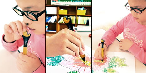
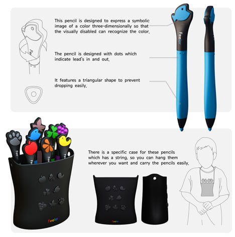
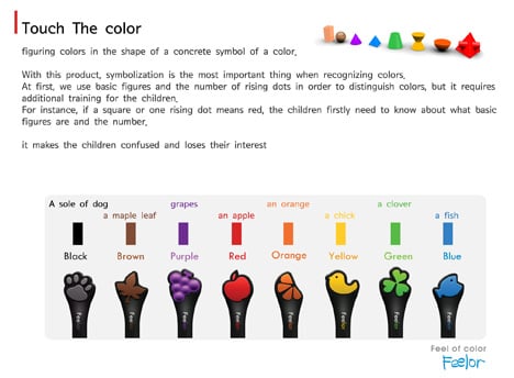
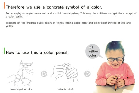
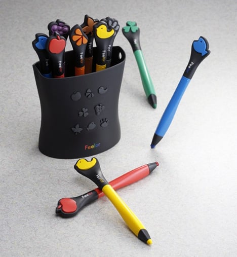
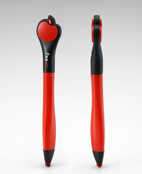
| Posted: 27 Oct 2009 12:00 AM PDT Feelor Touch the Color is a color pencil set that comes with a specialized character-form on the head. It's intended as a teaching aid for blind, preschool children, who are able to grasp concepts of shapes better than mere words or Braille. For example, if they are to color their page a particular color say red; they pull out a pencil with the head shaped as an apple, because apples are red. Likewise a chic stands for yellow, clover for green, and so on… This retractable lead pencil has a button on its side to pull the lead out or in and is ergonomically designed for a better grasp. The idea behind the project is nice, and the designing has been kept simple and easy for small children to understand. I think blind people have heightened senses, so touching and feeling for objects comes naturally for them. However, only the research experts in this field will be able to give us a proper verdict on the Feelor's feasibility and acceptance. Designer: Noh Ji Hun
|
| You are subscribed to email updates from Yanko Design To stop receiving these emails, you may unsubscribe now. | Email delivery powered by Google |
| Google Inc., 20 West Kinzie, Chicago IL USA 60610 | |


No comments:
Post a Comment